In a city as dense and fast-moving as New York, people need clear, reliable directions — and they need them fast. Whether someone is navigating your office building for the first time, looking for the nearest restroom in your lobby, or trying to find a tenant on the 14th floor, wayfinding signage is what bridges the gap between confusion and confidence.
Wayfinding signs are directional signs designed to guide people through a physical space. They range from simple arrows and floor plaques to full building directories and color-coded floor systems. In this guide, we cover everything NYC business owners, property managers, and office administrators need to know — from the four core types of wayfinding signage to design best practices and ADA compliance requirements.
What Is Wayfinding Signage?
Wayfinding signage — also called directional signage — is one of the oldest forms of visual communication. At its core, wayfinding is about giving people the information they need to find their destination without getting lost or frustrated along the way.
While GPS and smartphone maps are excellent tools for outdoor navigation, they fall short the moment someone steps inside a building. GPS cannot tell you which elevator to take, which wing the conference room is in, or where the emergency exit is located. That’s where wayfinding signs take over.
These signs typically use a combination of text, arrows, symbols, and color coding to convey direction, identify spaces, and help people build a mental map of their surroundings. They are used extensively in:
- Office buildings and corporate campuses
- Hospitals, clinics, and healthcare facilities
- Hotels and hospitality venues
- Schools and universities
- Shopping malls and retail centers
- Government buildings and courthouses
- Parking garages and transit hubs
The 4 Types of Wayfinding Signs
Not all wayfinding signs serve the same function. There are four primary categories, and a well-designed signage system typically uses all four in combination:
| Type | Purpose | Examples |
|---|---|---|
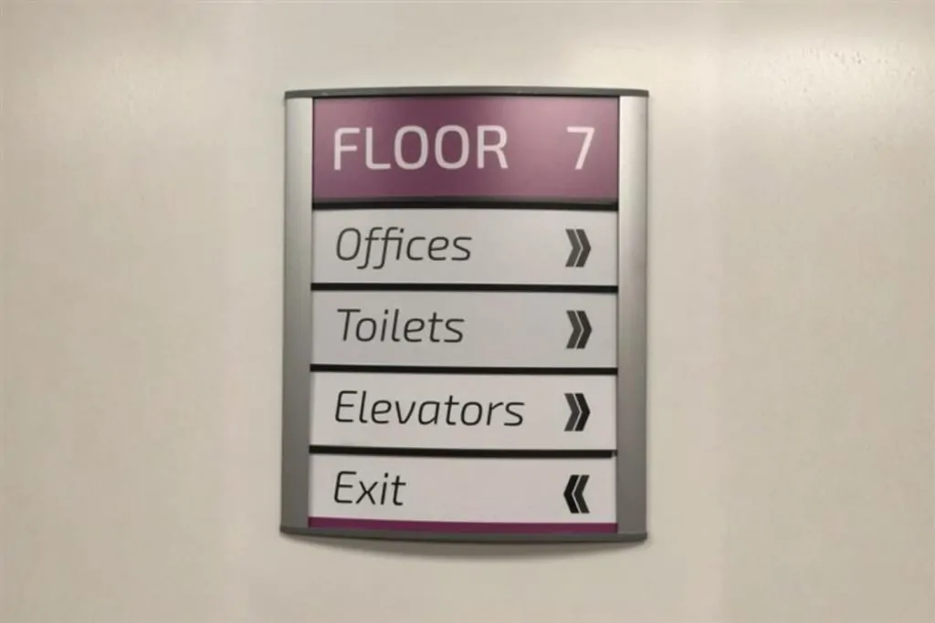
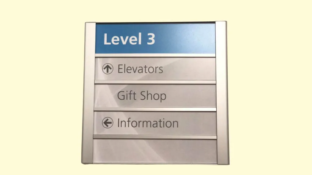
| Identification | Tells visitors they have arrived at the right place | Floor number plaques, door markers, department signs, restroom signs |
| Directional | Points people toward a destination using arrows or color cues | Junction signage, colored floor lines, lobby directories |
| Informational | Describes a general area or lists nearby amenities | Business hours, cafeteria location, elevator & restroom clusters |
| Regulatory | Controls behavior and ensures compliance or safety | “No Smoking,” ADA compliance markers, “Employees Only” access signs |
1. Identification Signs
Identification signs confirm that a person has arrived at their destination. These are the most common type of wayfinding sign you’ll encounter. Examples include:
- Floor number plaques at stairwell landings
- Door plaques (e.g., “Suite 802 — Acme Legal Group”)
- Department markers (e.g., “Human Resources — 4th Floor”)
- Restroom signs

2. Directional Signs
Directional signs actively guide people toward a destination using arrows, colored lines, or other visual cues. These are especially important in large or complex environments where visitors could easily lose their bearings. Examples include:
- Junction signage (“Conference Rooms → Left; Elevators → Right”)
- Colored lines on floors or color-coded wall stripes
- Building directories in lobbies
Frequency matters most for directional signage. Just like a well-marked hiking trail places signs at every junction, your building should have directional signs at every decision point where a visitor could take a wrong turn.
3. Informational Signs
Informational signs describe a general area or cluster of services rather than a single destination. For instance, a restroom sign is identification, but a sign that reads “Restrooms, Elevators & Vending Machines — Level 3” is informational. Additional examples:
- Business hours boards
- Cafeteria location signs
- Tenant directory boards
- Neighborhood landmark signs (common in NYC streetscapes)
4. Regulatory Signs
Regulatory signs are the most authoritative form of wayfinding. They control behavior, enforce access rules, and ensure safety and legal compliance. They use bold text and commanding visual design to leave no room for ambiguity. Examples:
- “No Smoking” signs
- ADA accessibility markers
- “Employees Only” or “Authorized Personnel Only” signs
- Emergency exit and fire safety signs
- Health & safety compliance notices

How to Apply Wayfinding Signs in Your Office or Building
Effective interior wayfinding is built around three fundamental concepts: landmarks, position, and navigation. Understanding these helps you design a sign system that feels intuitive rather than confusing.
Landmarks
Landmarks are recognizable visual anchors in a space — an atrium, a large window, a piece of artwork, a reception desk, or a bright accent wall. They help visitors mentally map a building by giving them reference points.
Pro Tip: Separating different zones or floors by color is one of the most effective landmark strategies. Color-coded walls, floor stripes, or accent signage instantly signal to a visitor “I’m in the right place” — or that they’ve taken a wrong turn.
Position
People need to know where they are before they can figure out where to go. “You Are Here” maps on lobby walls or floor directories are simple but powerful tools. A key rule: maps and directional arrows should always be oriented in the same direction the viewer is facing. Rotating a map to match the viewer’s perspective removes the guesswork and dramatically improves usability.
Navigation
Navigation connects landmarks and positions into a clear path from A to B. A good interior navigation system anticipates every decision point a visitor will face — elevators, stairwells, hallway junctions — and places a sign at each one. Never make a visitor walk more than 30–40 feet without encountering a sign that confirms they’re heading in the right direction.

Wayfinding Sign Design Best Practices
A strong wayfinding system is built on two non-negotiable principles: keep it simple, and keep it consistent.
Keep It Simple
Every sign should contain only the information relevant to that specific location, hallway, wing, or floor. Overloading a sign with information is worse than having no sign at all — visitors will ignore it or misread it. A good rule of thumb: one sign, one key message.
Keep It Consistent
Consistency is the backbone of any effective wayfinding system. Visitors should be able to immediately recognize your signage style and trust that it always means the same thing. This applies to:
- Fonts and typography
- Colors and their meanings
- Arrow styles and placement
- Sign sizes and proportions
- Icon and symbol choices
Typography Guidelines
Wayfinding signs should always use a clear, sans-serif typeface. Decorative or script fonts may be appropriate for branding elements, but directional information must always prioritize legibility. Recommended type characteristics:
- Sans-serif typeface (Helvetica, Arial, or similar)
- Easily distinguishable letterforms — avoid fonts with ambiguous characters (like “Il1” or “0O”)
- Uniform letter spacing
- A font family with multiple weights (light, regular, bold) for visual hierarchy
- Large x-height (tall lowercase letters) for readability at a distance
Note: New York City’s own subway system uses the Helvetica family — a benchmark for legible, accessible wayfinding typography.
Use a Design Grid
For complex multi-sign systems, a design grid ensures that all signs share consistent proportions. Start with a base unit (e.g., 1 inch = 1 grid unit) and scale your sign sizes relative to their importance in the hierarchy. Primary directional signs use the largest type; door plaques use the smallest.
Icons and Symbols
Universally recognized symbols — particularly those endorsed by the American Institute of Graphic Arts (AIGA) — supplement text and make signage accessible to visitors who speak different languages or have reading difficulties. Icons for restrooms, exits, elevators, stairs, and handicap access are standard in most commercial environments.

3 thoughts on “Wayfinding Signs for NYC Buildings & Businesses: The Complete Guide”
In a city as fast-moving as New York, clear wayfinding is critical. Great guide covering everything from simple directional arrows to comprehensive building-wide systems. Do you find that digital wayfinding displays are starting to replace static signs in newer buildings?
The best wayfinding we’ve ever installed was a complete system for a medical office building — patients were getting lost between departments constantly. After the signage went up, staff said they spent way less time giving directions. Clear signage pays for itself in productivity. Good guide.
Wayfinding is so underappreciated until people get lost in your building. We did a full wayfinding package for a 12-story office building in Brooklyn Heights last year and the property manager said tenant complaints about navigation dropped almost overnight. This guide explains exactly why that happens.