When it comes to the ordering of print material for commercial or individual use it may look different than the actual colors that seem to appear on the samples. It’s really important to achieve the right balance of color and texture for the printed design.
For maintaining consistency in color and texture the Pantone match system is largely used in print and signage industry. The Pantone Color Matching System (PMS) is the standardized color used as a reference around the world for upholding coherence in a pattern of colors.
It is a popular color matching system used by the printing and signage industry for providing accuracy in the colors of printed material. It allows the printer to reproduce the same color with consistency. Each Pantone color has a reference code color that allows the manufacturer from all over the world to get desired color pattern without any hassle.
Specific for Signage Industry
The design logo you see on your monitor is will never appear same on a printed sheet. The colors are displayed on the monitor and display devices are RGB colors models that are made for representation of electronic devices.
These RGB colors are device dependent colors and are not suitable for printing material. The Pantone Color Matching System is a standardized color matching system for signage and has become the standard model for designers and printing companies.
Each PMS color has a unique number system to ensure reliability for the same color. The designer from other locations can reproduce the same color with reference to Pantone number system.
The designer from other locations can reproduce the same color with reference to Pantone number system.
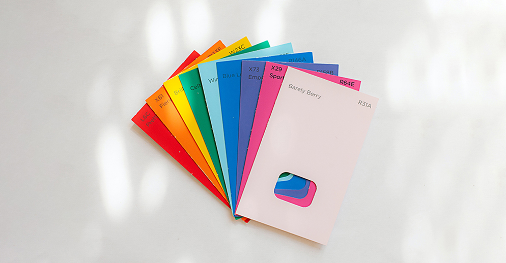
Pantone Spot Color Chart
The Pantone palette contains 1,114 colors, this vast range of 1,114 Pantone colors are created by mixing the 18 Pantone basic colors in different quantities or formulas offered by Pantone standard.
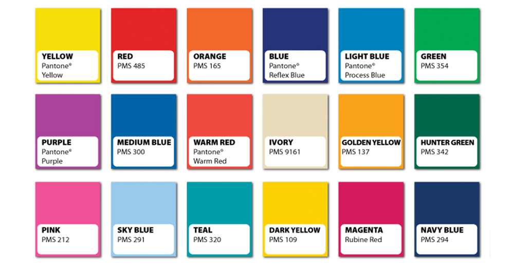
These Pantone colors are identified by unique number along with suffix of C, U or M. for example, Pantone Green363 can be identified as Pantone 363C (C= Coated Paper), Pantone 363U (U= Uncoated Paper) or Pantone 363M (M=Matte Paper). These Pantone colors are exclusively designed for graphic signage industry.
The Pantone Color of the Year
Every year the Pantone Color Institute chooses an annual “Color of the Year.” The color of the year is declared on the basis of a debate held at the annual meeting.
When Pantone declared its Color of the Year, the signage and graphics industries pay attention toward this. No doubt the color of the year is prevailing color around the signage industry and as well as in fashion industry.
For the current year 2017, the color of the year is green as green depicts nature and originality.
Pantone vs CYMK Printing
There are two major types of printing inks used in commercial printing, and here we will discuss the limitations and differences between the two ink color types.
- CMYK printing CMYK has also referred Process Ink Colors, are used in industrial printing to produce full-color printing. In this color printing is done only with for colors that are overlapped to form a structural printing.All the other colors required by images printing is generated through by these four colors. The graphics are created on tiny dots then are overlapped to process printing.
- PMS Printing PMS printing is also known as spot color printing. The PMS printing is done without tiny dots or overlapping. The Pantone palette has 18 basic colors and other colors are created by mixing equal proportion of other Pantone colors.
This mixing of colors takes place according to the ink mixing formula developed by Pantone.
Why Choose Spot Color Printing Over CYMK?
Here are many limitations offered by CYMK printing that encourages us to use sports color printing over CYMK printing.

- PMS hold subjective colors and designers are sure about the accuracy of Pantone colors. Whereas the CYMK doesn’t hold any accuracy of colors for the print material.
- With PMS, each design can be reproduced with the reliability of consistency in color that is not possible with the CYMK. On the other hand, the design reproduced with CYMK may have variation in shades.
- Here are some bright and vibrant colors that cannot be produced with CYMK printing such as navy blue and aesthetic orange.
- As CYMK is printing is done through the overlapping of tiny dots, this cannot smoothly cover large areas. On the top of that PMS can cover large areas with great saturation for printing and can deliver consistent results.
These are the factors that can surely convince you to go for Pantone matching system (PMS).

3 thoughts on “How Pantone Matching System (PMS) Taking Over the Signage Industry?”
PMS color matching is essential for brand consistency across all signage. When a client gives us their Pantone colors, we can guarantee their signs match their business cards, website, and everything else. Without PMS, you’re guessing — and guesses show up as mismatched branding.
Color accuracy is everything in our line of work. We use PMS for every vehicle wrap to ensure the brand colors are exact across every truck in a fleet. This article does a great job explaining why standardized color matching matters so much in the print and signage industry.
The Pantone system is one of the most important tools in any sign shop. We’ve been using PMS matching for decades and it’s the only way to guarantee color consistency across different materials and print methods. Good article explaining how it works and why it matters.