Step and repeat banners are one of the most powerful — and most underused — tools in a New York City business’s marketing arsenal. They’re the backdrop at every red carpet event, every press conference, every product launch. They’re how brands get their logo into every photo taken at an event, without buying a single advertisement.
If you’ve ever seen a celebrity or politician standing in front of a wall of repeating logos, you’ve seen a step and repeat. And the good news is: they’re not just for Fortune 500 companies or Hollywood studios. Any NYC business can use them — and should.
This guide covers everything: what step and repeats are, how they differ from regular backdrops, why they work, how to size and design them, and how to place an order with Signs NYC.
Backdrop vs. Step & Repeat — What’s the Difference?
“Backdrop” and “step and repeat” are often used interchangeably, but they’re not quite the same thing:
Backdrop Banners
A backdrop banner is the broad category name for any large banner used as a background in photography, events, or presentations. Backdrops are used for:
- School photography shoots
- Corporate headshot sessions
- Theater productions and cultural events
- Home media and broadcasting setups
- Trade show booths
Backdrops are versatile and interchangeable — the same frame can hold different banner inserts for different occasions.
Step and Repeat Banners
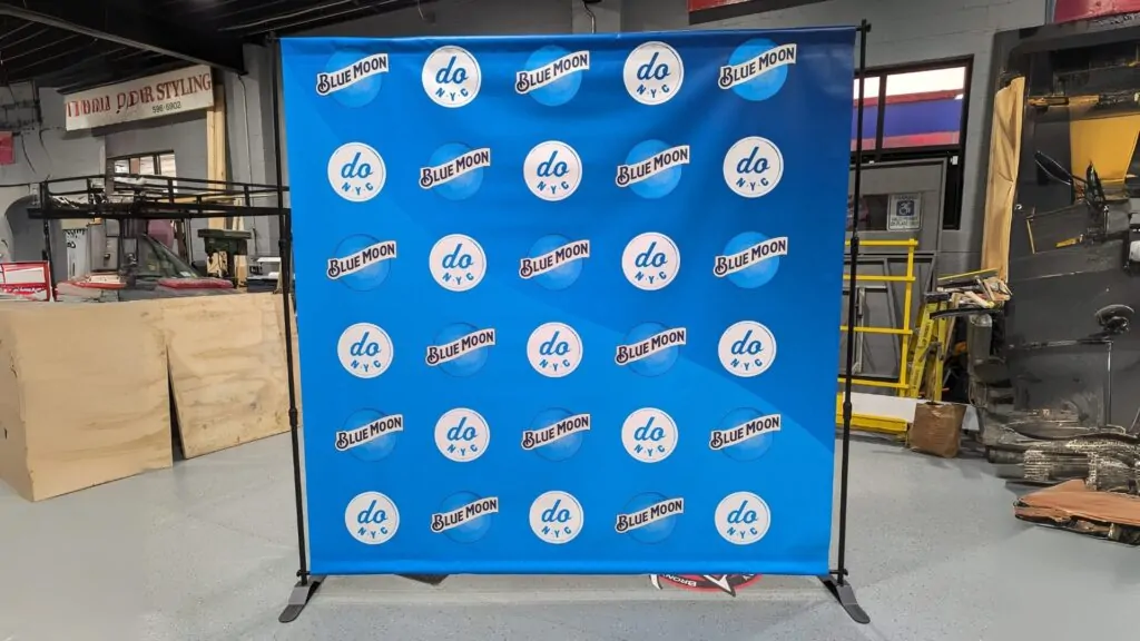
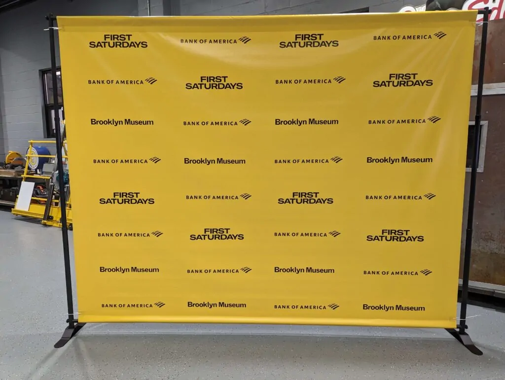
Step and repeat banners are a specialized, high-end type of backdrop. They’re defined by their signature design: your logo (and often sponsor logos) repeated in a tiled pattern across the entire banner surface. This is the look you see at:
- Press conferences and media events
- Award ceremonies and galas
- Corporate brand activations
- Product launches and grand openings
- Charity events and fundraisers
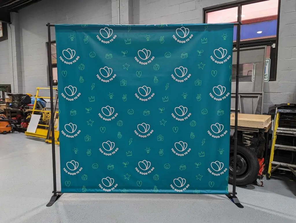
The step and repeat’s distinctive repeating pattern is not just aesthetic — it’s strategic. Read on to understand why.
Why Step and Repeats Are Designed the Way They Are — The Rule of Thirds
The repeating logo pattern in a step and repeat banner is specifically engineered to maximize brand exposure in photographs. Here’s the strategy:
The Rule of Thirds
Professional photographers and cinematographers use a compositional principle called the “rule of thirds.” A frame is divided into a 3×3 grid by two horizontal and two vertical lines. The most visually compelling subjects are placed along these gridlines — not in the center of the frame.
When attendees pose in front of a step and repeat banner, the photographer automatically frames them using this grid. The repeating logo pattern ensures that no matter where the subject stands, no matter how they’re framed, your logo appears prominently along those gridlines — often multiple times per photo.
Getting Your Logo in Every Shot
With a standard backdrop, a single large logo might get cropped out of tight shots or obscured by the subject. With a step and repeat, the repeating pattern guarantees that some portion of your logo is visible in virtually every photo taken in front of the banner — whether it’s a wide shot or a close-up headshot. This delivers consistent brand visibility across hundreds or thousands of photos, all at zero additional cost.
Benefits of Step & Repeat Banners for NYC Businesses
Instant Credibility and Prestige
Step and repeat banners signal professionalism. They’re associated with high-profile events and well-resourced organizations. Using one at your event — whether it’s a small networking mixer or a major product launch — immediately elevates the perceived value of everything happening in front of it.
Passive Brand Amplification
Every attendee who poses in front of your step and repeat becomes a brand ambassador. Every photo they share on social media, every press photo that gets published, every screenshot that gets forwarded — your logo travels with it. This is earned media at zero marginal cost.
Reusable and Portable
Most step and repeat banners are printed on lightweight vinyl or fabric and pair with portable retractable stands. The banner rolls up, fits in a carrying case, and can be transported to any venue in the city. One banner can serve dozens of events over multiple years.
Works for Any Business Size
Step and repeats are used by Fortune 500 companies and local Brooklyn boutiques alike. The format is infinitely scalable to your budget and your event size.
Photography Backdrops: Sizing Guide & Setup Options
Whether you need a step and repeat for a media event or a simpler backdrop for a photography shoot, choosing the right size is critical. Here are the most common configurations:
Standard Sizes for Event Backdrops
- 8′ x 8′ — Standard for small booths, individual headshots, and intimate events
- 8′ x 10′ — Most common for step and repeats; fits 2–3 people comfortably
- 10′ x 10′ — Popular for trade show booths and larger group shots
- 10′ x 20′ — Red carpet or large-format event installations
- Custom sizes — Any dimension available for venue-specific requirements
Choosing the Right Size
The key question: How many people will be photographed in front of it at once? For individual or couple shots, an 8′ wide banner is sufficient. For group photos of 4–6 people, go with 10′ or wider. For mass media press conferences, 20′ is the standard.
Also consider the venue ceiling height. Standard event venues in NYC typically have 8’–12′ ceilings. Make sure your banner height doesn’t exceed the available space with the stand extended.
Stand Options
- Retractable banner stands — Easiest to set up and transport, best for indoor use
- X-frame stands — More affordable, excellent for smaller backdrops
- Adjustable pipe-and-drape systems — Best for very large or custom-shaped installations
Ordering Your Step & Repeat Banner — What to Provide
Placing an order for a step and repeat is straightforward when you know what to prepare. Here’s exactly what Signs NYC needs:
Logo Files
Provide your logo in a vector format (AI, EPS, or PDF) or a high-resolution PNG with a transparent background. Low-resolution JPEG or web-ripped images will not print cleanly at banner scale. If you’re not sure what format you have, send it to us and we’ll assess it.
Brand Colors
Provide your exact brand colors in PMS (Pantone) or CMYK format. If you only have HEX codes (web colors), we can convert them, but note that screen colors and print colors can vary.
Sponsor or Partner Logos (if any)
For multi-logo step and repeats, provide all logos in high-resolution format. Specify whether the logos should be equal size or if certain brands should be given more prominent placement.
Banner Dimensions and Stand Requirements
Tell us the final display size you need and whether you need a stand included with the order. We carry retractable stands for all standard banner sizes.
Multilingual Notices
For events where printed text is included on the backdrop (event name, tagline, hashtag), specify the text exactly as you want it displayed — including any special characters, registration marks, or trademark symbols.

3 thoughts on “Step and Repeat Banners & Backdrops: The Complete NYC Design & Ordering Guide”
We print a lot of step and repeats for events in Brooklyn and Manhattan. The sizing recommendations here are really helpful — a lot of clients underestimate how large the banner needs to be for group photos. Good call mentioning that wrinkle-free fabric option too.
Solid ordering guide. The tip about logo spacing and sizing for camera distance is something most people miss. We’ve had clients come to us after getting burned by banners where the logos were too small to read in photos. This guide would have saved them the trouble.
Step and repeats have exploded in popularity over the last decade. This guide covers everything a first-time buyer needs to know. One thing I’d add — always order your banner at least two weeks before the event. Rush jobs for these never turn out as well.